Why your website gets no leads: 3 mistakes and how to fix them
A beautiful website does not guarantee enquiries. Explore three conversion mistakes, practical examples and a mobile checklist before commissioning a website audit.

Your website can look polished and attract visitors while generating few enquiries. Before paying for a redesign or increasing your advertising budget, check whether people understand your offer, have reasons to trust you and can easily take the next step. This guide is for small businesses, service companies and online stores.
Website not converting? Find where enquiries are lost
A lack of enquiries is not always a design problem. Demand, traffic sources, pricing, terms, form reliability and your team's response all affect the outcome. Visitors looking for a different service may never become customers, even on a well-designed page.
Follow the whole journey from the traffic source to the landing page and the enquiry reaching your team. A button click, a successfully submitted form and a qualified lead are different events. Measuring them separately helps locate the issue.
Mistake 1. The first screen does not explain what you do
A headline such as “Next-generation solutions” does not identify your service. Explain the offer, its audience or location and the outcome. Large images and animation should support that information.
For example, a service company could replace “Creating comfort” with “Air conditioning installation for homes and offices in Uzhhorod”. Then explain the scope and how to request an estimate. This is an illustrative copy example, not a QODEVRA client case.
Briefly show the first screen to someone in your target audience, hide it and ask what they remember. A five-second test explores first impressions; it does not prove that every visitor leaves after five seconds. Test usability separately by asking someone to find a service and submit a test enquiry.
Mistake 2. Customers cannot see why they should choose you
“High quality” and “personal service” are not sufficient evidence. Visitors comparing providers need relevant experience, work examples, clear terms, a process and authentic reviews.
Describe a case through the problem, your work and a verified outcome. If you do not have measured results, show the scope and functionality without inventing percentages. Clearly distinguish design concepts from completed projects.
Explain who customers will work with, what affects the cost and how deliverables are agreed. Publish only photos and reviews you have permission to use.
Mistake 3. There is no clear next action
Replace an ambiguous primary button with an action that fits the visitor's intent: “Request an estimate”, “Book a consultation” or “Call us”. The destination must deliver that promised next step.
Choose a primary action for each page and offer an appropriate alternative contact method. Several equally prominent buttons compete for attention. Repeat the main action after enough information has been provided.
Ask only for details needed for the first response. Use clear visible field labels, helpful error messages and a submission confirmation explaining what happens next. W3C describes how to associate labels with form controls for accessibility.
A mobile website audit checklist
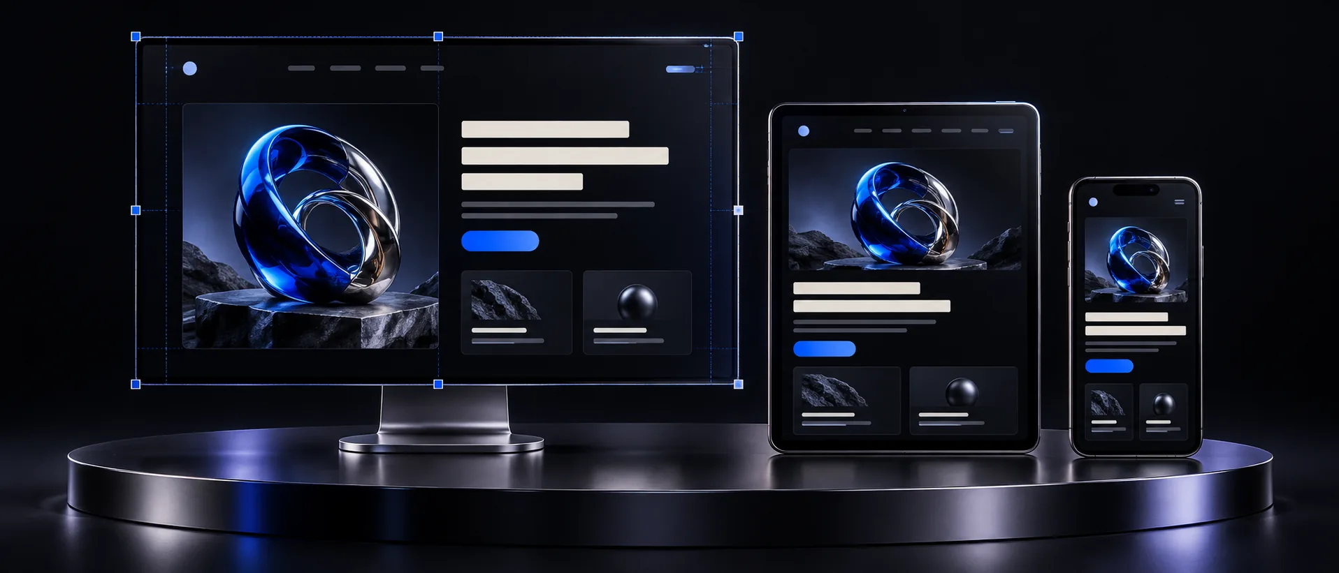
Follow the customer journey on a real phone. Check the service page, navigation, form and confirmation. Mark your enquiry as a test and confirm that the responsible person receives it.
- The heading explains the offer and audience.
- Text fits the screen and is readable without zooming.
- Widgets do not cover buttons or form fields.
- Real work examples and clear terms are available.
- The phone link opens the correct number.
- Forms explain errors and confirm submission.
- Your team receives the enquiry and knows who should respond.
How to measure whether changes helped
Record relevant visits and confirmed enquiries over a consistent period before editing. For an agreed dataset, enquiry conversion is successful enquiries divided by sessions, multiplied by 100%. For example, 20 enquiries from 1,000 sessions is 2%. This is a hypothetical example, not a benchmark or a QODEVRA result.
Compare lead quality, devices and traffic sources too. Advertising, seasonality and pricing can change alongside design. With limited traffic, avoid drawing conclusions from one day; test improvements in sequence and record each change.
Common questions about website enquiries
Do you need a complete redesign? Not always. Clearer copy, better evidence or a form fix may be enough. Assess a full rebuild against the current structure, technical constraints and business goals.
Will SEO solve the problem? SEO can attract relevant visitors, but it does not replace a clear offer or a working enquiry process.
Can an audit guarantee more sales? It identifies obstacles and priorities. Results also depend on demand, the offer, budget and sales handling, so a precise uplift cannot be promised in advance.
Request a website audit from QODEVRA
A good website helps people understand the offer, assess credibility and act. Send your website link and explain the enquiries you want to receive.
Message “АУДИТ” to QODEVRA on Instagram or use the website contact form. We will discuss your goals, available data and the scope of the review. Fees and the working format are agreed before work begins.
Services and next-step costs
The review may identify a need for copy changes, UI/UX work, landing page improvements, technical SEO or maintenance. Scope follows the problems found. See our price list for service starting prices.